Life In A Dollhouse logo: a periwinkle house silhouette with a round window and the shop name lettered inside Proposal

Prepared 6 September 2026 The live store (opens in a new tab)

A proposal for Ella Doyle and Life In A Dollhouse

Four documents, one to a room.

What visitors run into, what the theme measures, what the catalog holds, and a homepage built to fix it. Each document opens in its own tab, so this page stays put as the front door.

Everything was measured on the live store on 6 September 2026. No analytics, order data or customer interviews were available, and the research says where that matters.

  • UX research (opens in a new tab)

    What a first-time visitor runs into, who actually buys, who else sells miniatures, and the four paths to a purchase.

    • 16 pain points, each scored out of 12
    • 4 personas and 5 competitors
    • 4 user flows, step by step
    • A 26-step roadmap in four phases
  • Design audit (opens in a new tab)

    A condition survey of the live theme, measured in headless Chrome at 1440 and 390 px: fonts, contrast, layout, tap targets, page weight.

    • 24 findings: 5 critical, 10 serious, 9 to polish
    • A 2.95 MB heading font, 64% of the page
    • Buttons at 1.84:1 against a 4.5:1 requirement
    • A fix schedule by week, month and quarter
  • Catalog browser (opens in a new tab)

    Every one of the 249 live products, searchable and filterable, with the answer to where the brand actually sells.

    • 249 products from $1 to $2,750
    • Filter by category, room, status and price
    • 15 products sitting in no collection
    • Direct sales only, plus a dormant Etsy shop
  • Homepage redesign (opens in a new tab)

    A working prototype built on one fact: at 1:12 scale, one inch on the shelf is one foot in a real house.

    • Scroll through the front door into the rooms
    • Shoppable hotspots on Ella's real builds
    • Ella's story, the press, a custom-work inquiry
    • Every section maps to one Shopify theme section

Where to start

Depends on how much time you have, and whether you would rather read or look.

Ten minutes
Open the design audit (opens in a new tab) and read the summary and the fix schedule. The first six fixes are about three hours in the theme editor, with no development.
An hour
Read the UX research (opens in a new tab) end to end. Section 8 is the three things to do if nothing else gets done.
Rather look than read
Open the redesign (opens in a new tab) and scroll. It runs in the browser. Product photos load from the store, so it needs a connection.
Checking one product
The catalog browser (opens in a new tab). Press / to search. Filters stack, and the address bar keeps your view so it can be shared.

If only three things get done

In priority order, from section 8 of the research (opens in a new tab).

  1. Turn the commission into a product.

    A brief form, published price bands and a stated timeline. It is the highest-value flow on the site, the weakest experience, and the one offer no competitor in the set has. Today it is a Gmail address typed into a paragraph.

  2. Answer "will it fit" and "is it good."

    Dimensions on all 249 products, and reviews with customer photos. These are the two questions blocking every purchase, and the two gaps almost the whole competitive set shares.

  3. Say who made this.

    Ella's name and story above the fold, press logos beside them, and a nav link that reaches the page they are on. Original design by a named maker with national coverage is the position. Right now the storefront hides it.

The store today, and as proposed

Both open in a new tab: the audit's full-page capture on the left, the working prototype on the right.

The current homepage at 1440 px: a row of product cards with the shop's house-shaped watermark over each photo, then an uneven grid of dollhouse photographs with no captions Full-page screenshot (opens in a new tab)
Today. The watermark sits on the product, and the gallery below it has no captions and no links.
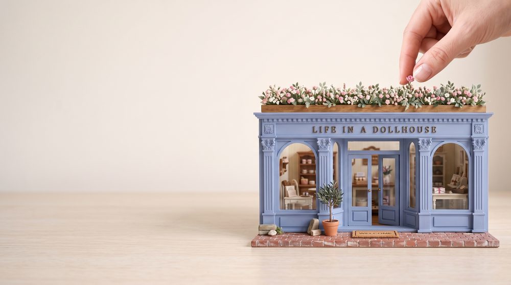
The proposed hero: a periwinkle miniature shopfront with brass letters reading Life In A Dollhouse, a planter of tiny pink flowers on its roof, and a fingertip reaching in to adjust one flower Homepage redesign (opens in a new tab)
Proposed. A headline, one line of copy and a door to walk through, over a single responsive image.